Context
Following the launch of Deliver My Container, a natural next step emerged from conversations within the founders' network. DMC's investors were freight forwarders themselves, and they recognised that the logical continuation of the platform was domestic road transport. Once your container arrives in the UK, it still needs to get from A to B. A separate group of investors backed the idea of a sister company to handle exactly that, and Freight Delivery Network was born.
The Problem: The Efficiency Bottleneck
We needed FDN to feel like a native, "road-ready" product for UK hauliers, yet we were operating in an Early Alpha environment with extremely limited resources.
- The Identity Gap: DMC was built for "Global & Maritime" contexts. FDN needed to resonate with domestic "Tarmac & Local" operators who have different cultural expectations.
- The Build Constraint: We couldn't afford to maintain two separate codebases. We needed a system that allowed one engine to power two distinct brand experiences.
My Role: Design System Lead & Brand Strategist
I moved from designing features to architecting the entire brand and component framework for FDN, owning everything from the logo to the design system.
- Token-Based Theming: I defined a system of design tokens covering colour, typography and elevation that allowed FDN to have its own distinct identity while sharing 90% of the underlying component logic with DMC. This meant a single developer could maintain both platforms without duplicating work.
- Visual IP Creation: I led the creation of a custom 3D isometric asset library that gave FDN a unique visual identity. The assets served a dual purpose, acting as both a brand differentiator and a UX tool, using visual recognition to help users navigate complex logistics data quickly and intuitively.
- Identity Design: Created the FDN logo and colour palette to communicate speed and domesticity, grounding the brand in the reality of UK road freight rather than the global maritime feel of DMC.
Business & Technical Constraints
- The "Reuse" Mandate: To ensure a viable speed-to-market for the pilot, we had to reuse at least 70% of the DMC core logic. The brand layer had to provide the distinction.
- Developer Velocity: With a single full-stack developer (Adam), the system had to be "plug-and-play." I needed to build a framework where a single theme-switch could re-skin the entire marketplace.
- Alpha Agility: Because the product was in Alpha, the design system had to be modular enough to pivot based on early user feedback without requiring a total redesign.
The Strategic Shift: From App to Platform Framework
The core innovation was moving from a single-app mindset to a Multi-Vertical mindset.
- Decoupling Brand from Logic: I identified which parts of the UI were "Core Utility" (the table systems, the auction logic) and which were "Brand Skin" (the iconography, the 3D trucks, the colour tokens).
- Systematised Visual Language: This allowed us to "re-skin" the marketplace engine for the FDN pilot in a matter of weeks, proving the business could expand into new sectors with minimal capital expenditure.
The design of the evolution with the FDN logo from the orange DMC logo
I still wanted to maintain the simplicity of the chevrons representing a ship from DMC to make the designs relatable. The earlier versions we had the idea of making the letter "F" for FDN.
The Final Design of the FDN logo
The final rendition of the logo, I went for a double chevron moving to the right to represent "keeping things moving" drawing inspiration from the "fast forward" symbol. The FDN identity was designed to feel distinct from DMC while sharing the same design language. Where DMC communicates global scale and industrial authority, FDN needed to feel fast, local and road-ready. The typography leans into movement and the colour palette was chosen to resonate with the UK SME haulier market.
The colour palette we went with
Where DMC uses a bold orange, black and blue palette to communicate global scale and industrial authority, FDN deliberately steps away from that. The light blue, navy and grey palette was chosen to feel approachable and professional for the UK SME haulier market, familiar enough for existing DMC users to trust, but distinct enough to feel like its own product.
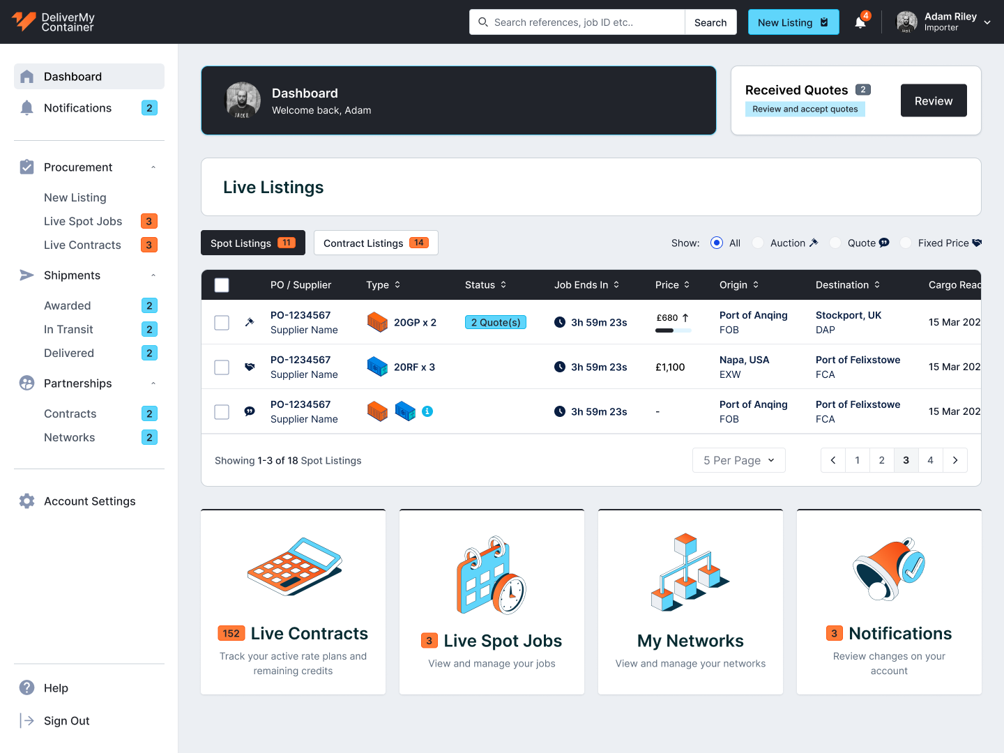
Design of DMC admin Screen
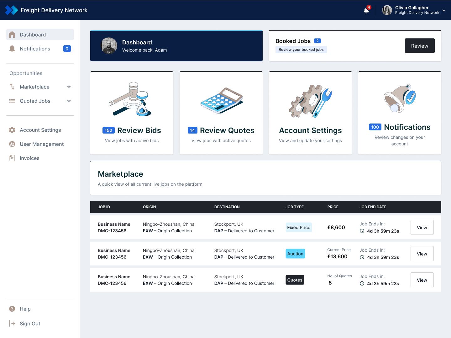
Design of FDN admin Screen
Despite being two distinct brands, the underlying interface structure is identical. A user familiar with DMC can navigate FDN instinctively from day one. The brand layer provides the differentiation, the component layer provides the familiarity.
Outcome
FDN was warmly received within the industry, with freight forwarders who engaged with the platform early responding positively to both the interface and the concept. However, with a small team and DMC still requiring significant development resource, full adoption of FDN was always going to be a longer game. The platform is currently on the back burner while DMC reaches its full potential, at which point the two are designed to converge into a single end-to-end solution. The V1 launch proved the concept was viable and that the multi-tenant design system worked exactly as intended. One codebase, two products, minimal overhead.